Project Overview
-
The Product: HairCare is a hair and beauty service app that helps people find and book their desired service from any location.
-
Project duration: 6 weeks.
-
The problem: HairCare is a hair and beauty product company that wants to expand its business within the hair and beauty industry. One of its main expansion ideas is to build an app where users can find and book hair services from any location.
-
The goal: The goal is to build a mobile application where users can find and book hair services from anywhere in the most stress-free and efficient manner.
-
My role: UX/UI Designer & UX Researcher
-
My responsibilities: User research, wireframing, prototyping, and usability testing.
Design Process

Understanding the user

Starting the design
-
User research
-
Personas
-
Problem statements
-
User journey maps
-
Paper wireframes
-
Digital wireframes
-
Low-Fidelity prototype.
-
Usability study

Refining the design
-
Mock ups
-
High-fidelity prototype
-
Reflection
Understanding the user

-
User research
-
Personas
-
Problem statements
-
User journey maps
Research: Why user interview?
I chose to do user interviews as my choice of research method these are the reasons why:
-
It allows me to cover related topics around the user’s motivation and feelings and how they would use similar products.
-
User interviews provide an understanding of different aspects of users’ daily lives as it relates to the project.
-
Helps me plug any knowledge gaps I’m unaware of. Fine details like this can make the biggest difference.
-
Gain deeper insights between user and product, this insight will help me humanize the product.
Research: User pain points
1. Waiting - We discovered a vast amount of users don’t like waiting in line for their service as it consumes a lot of time.
3. Lack of knowledge - Different ethnicities have different hair types and some users spoke of experiences of hairdressers did not know what to do with their hair type.
2. Limited access - A lot of users don’t have access to hair service consistently due to personal obstacles concerning health and family commitments.
4. Service anxiety - A lot of users said they can get anxious prior to hair service if they haven’t seen a collection of hairdressers’ work.
Research: User persona

Janet Adams
Age: 39
Gender: Female
Nationality: British Jamaican
Location: Leeds, United Kingdom
Family: Husband & 3 Children
Occupation: Project Manager
Problem statement: “As a mother of 3 I would like a hairdresser to come to me, so I can save time and be more productive.”
Goals
-
A child-friendly environment where children can get a haircut
-
Save more time, so she can be productive.
Frustrations
-
Hairdresser is not able to style her children’s hair type
-
Waiting in barbershop queues.
-
Arriving home late after spending hours at the barbershops.
Janet is a project manager at Barclays Bank, she spends 2 days a week working from home and 3 days a week in the office. On top of maintaining her professional career, she has to maintain her family life as she is a mother of 3 boys (4,13,15). Her husband is a filmmaker so he spends months away. One of her frustrations is taking haircuts because it consumes time, and energy furthermore it’s not a child-friendly environment.
Research: User journey

Research: Competitive audit
.png)
I understand that UX design is not just for user experience, the business seeing results is an important factor as well. To enhance the chance of getting the best product possible, I did a competitive audit. To see what I can learn from major market shareholders.
Research: Competitive audit discoveries
After doing an audit on similar products that dominate the market share, I gathered some opportunities for myself to explore:
-
A page where hairdresser and barbers can present their work.
-
GPS feature for customers.
-
Mobile services for those who are always traveling.
-
A service for hairdressers who can do mobile but cannot afford a shop.
-
Accessibility for those who are physically handicapped.
Starting the design process

-
Sitemap
-
Paper wireframing
-
Digital wireframes
-
Low-Fidelity prototypes
-
Usability studies
Design: Sitemap
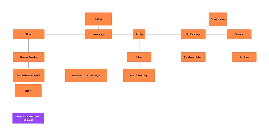
I gathered the information from the research and created a sitemap that would feel easy for the user to navigate.
Design: Paper wireframes

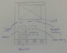
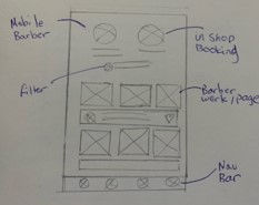
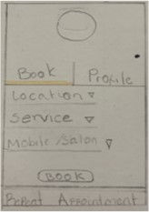
These are the paper wireframes I iterated from research and sitemap gatherings.
Design: Digital wireframes


Design: Usability test
I did a short usability test with the digital wireframes to see how the user felt about the product. This gave me an insight into the direction I was going with the product and how I can further improve it in the refining stage. This was the feedback:
-
Nowhere to add notes for hairdressers.
-
The user did not understand some of the jargon (hair type on the filter page).
-
Customers took a long time on specific pages due to cognitive overload.
-
User journeys can be more seamless and intuitive.
-
Lacking visual consistency.
Refining the design

-
Mock ups
-
High-fidelity prototype
-
Reflection
Before usability test

After usability test
Due to the feedback in the usability study, I decided to alter the home page, using a mental model of how the user would think during this process to increase intuitiveness. Also, I used Hicks's law to reduce cognitive overload by only putting what the user needs on the screen at the time.
.png)
Before usability test
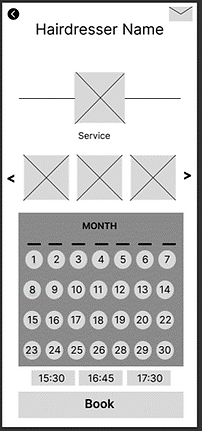
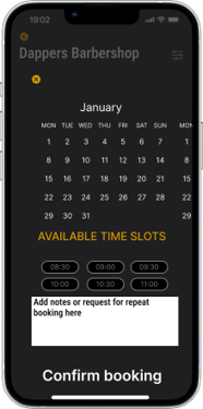
I used Hicks's law on the hairdresser page for less cognitive overload, the calendar overlay only appears when the customer presses book now. Also, I used the Gestalt law of similarity and common fate by making this page similar to the homepage so the experience is more seamless and natural.
After usability test

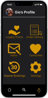
User profile page
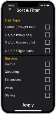
Filter page
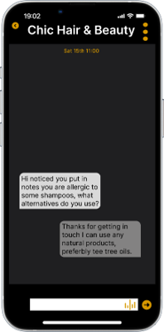
Chat/message box
Book calendar overlay
Moving forwards

-
Next time I would like to do more in-depth research on assisted technology.
-
Add some animation minor animations like sound effects to alert or keep the user more engaged.